8.01.2011

Self Portrait

Squinty-eyed in the summer sun on my back porch. There were moments when I was truly thankful to not be an ant or a little plastic army man melting in the insane light and heat reflecting back at me from the mirror I used.

Self Portrait (detail), charcoal and graphite on paper, 2011

7.12.2011

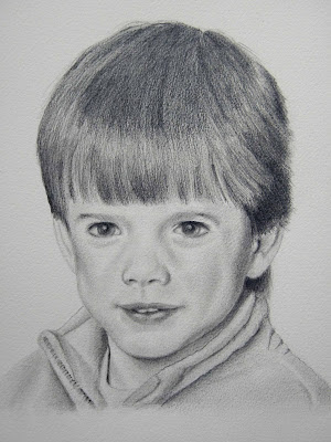
Bram


Both boys are actually in this drawing, but I've cropped it to detail only Bram in the foreground. I'm doing a tiny series of four drawings of Edison and Bram lounging together and when I've completed them all, I may go back and do a color wash over them to make them a bit more interesting. Or then again, maybe not.

Edison and Bram (detail), charcoal and graphite on watercolor paper, 2011

7.11.2011

Chihuly Show

Is it possible to be both impressed and unimpressed with something at the same time because I finally dragged my lazy ass to the Dale Chihuly show at the MFA and I have to say I found it to be less than spectacular. Don’t get me wrong, the glass itself was beautiful (I’ve always wanted to blow glass myself but seeing as I hate being hot and sweaty and I get easily winded, it's never going to happen) and there were some surprisingly lovely bits like the little crystal cherub tucked amongst a ceiling full of endless anemones, starfish, tubes, bowls and balls, but mostly it was really pretty dull.

One thing that annoys the hell out of me is artists who, once they’ve gotten too big for their fancy little britches, rely too much on their minions (or studio monkeys as I like to call them) to do the bulk of the work and it’s pretty obvious that Chihuly is one of those artists because there’s no way he blew all that glass himself. I know that apprentices and assistants have been around as long as there have been artists churning out the goods in their workshops and studios, but it still pisses me off. An artist’s work should be an artist’s work from their own hand, not that of someone working anonymously under said Big Name Artist, no matter their medium. The bowls available in the show’s gift shop that one is required to pass through in order to leave the exhibit, made by “an artist in the Dale Chihuly Studio” (who is of course nameless and faceless), bore an average price tag of $5000 apiece.
Seriously?

Okay, so maybe I’m too damn persnickety about the semantics of art, but I was sad that I felt so let down by this show. After all, it had been built up in the local media as being something truly extraordinary. I kept my thoughts to myself and after pondering all that glass for a couple of days, was just beginning to think there was something wrong with me for not being ecstatic over every last detail when Griffin quietly (and out of the blue while we sat lazing in the summer sun a few afternoons later) admitted to me that he thought the show was “shit” and hoped his confession wouldn't take anything away from my experience. I laughed out loud. Never believe the hype till you see it with your own eyes.

And the ironic thing is, I have to go see this show a second time with David. Do you think there's any chance it will magically improve by then?

Photo courtesy of Derek Mau.

7.04.2011

David


Portrait of David, graphite on paper, 2011

5.07.2011

Georgia O'Keeffe

I've never made any bones about the fact that I can't stand Georgia O'Keeffe; not the woman, per se, but rather her work. And I've always had a fairly detailed outline in my head of her life and who she was as a human being, despite my dislike of her paintings, so I thought I knew her pretty well. But recently I saw a biographical film of her that was incredibly well-written and beautifully shot, itself a piece of art and not your typical run-of-the-mill, movie of the week type fare. It left me more impressed with the woman than I've ever been before. I thought, 'What the hell, maybe now that I have a deeper perspective on her personality, maybe -just maybe- if I give her art another go, I might find I like it.' Nope. Not a chance! I still despise every last one of those steer skulls, New Mexico pieces and all those hideous labial flowers (though I don't mind some of her earliest drawings). Hell, I tried. I really did.

I liken this to Stephen King's book "The Shining" vs Stanley Kubrick's film version of the same. So many people have such strong opinions on this subject (King included) and feel that the book and this movie cannot ever be reconciled with one another. I have no problem with this whatsoever: for me the two are completely separate entities and both can and do stand equally on their own. I can love and admire both. Likewise, Georgia O'Keeffe and her art, can for me be two entirely separate realities fully independent of one another: one I love and admire and the other I utterly loathe.

Blue Flower, 1918

5.04.2011

Self Portrait With Hat


I've grown tired of drawing myself with short hair, in a mirror, over and over again so to mix things up a bit I dug out a photo of myself from a couple of years ago when I still had (very) long hair. Man, do I miss that hair!

Self Portrait With Hat, graphite on paper, 2011 (full view and detail)

4.22.2011

Young Griffin


A portrait of Griffin as a child (see "Griffin," December 30, 2010 for a portrait of him as an adult). His eyes were really odd in the photo I used for this drawing and I just couldn't seem to get them right. He had, and still has, amazingly thick and lustrous eyelashes that any girl would kill to have, thus his looking as though he was wearing mascara and eyeliner. And I think he might have had a sinus thing on that particular picture day, which would account for the terrible puffiness around his eyes. Regardless, I draws 'em as I sees 'em.

Portrait of Griffin as a Child, graphite on champagne colored paper, 2011 (full view and detail)

4.17.2011

Portrait of a Cat, Again

Another portrait of Maia Louise, this time in nearly three-quarter profile and again, much larger than life. Oddly, I'm seldom asked to do drawings of cats. I have no idea why this is. Maybe because people love their dogs more. Who knows?

Portrait of Maia Louise, graphite on paper, 2011 (detail)

4.10.2011

Baby Self Portrait


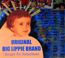
I found (after not knowing for some time where all those baby photos from that photo shoot were) a version of the old photo of me used in the Big Lippie Brand collage in the right sidebar and decided to do a smallish portrait of myself from it. Oddly, I found it tough to get the big lippie right. Go figure.

Portrait of Victoria as a Baby, graphite on paper, 2011, (full view and detail)

4.04.2011

Two Paper Quilts


I've been in my cellar re-packing and organizing the stored boxes and crates that contain my entire studio and found a few stray experimental works; an idea that proved at the time to be a creative dead end for me. Here are two paper quilts made many years ago and until about a week ago, long, long forgotten. I haven't a clue where I was going with this idea, but all the photographs in these works are of my actual female ancestors. Despite their vivid colors, as works of art these really do suck, but I remember how much I loved the time spent pondering all those ladies who came before me in my clan.

The Good Wife, mixed media on paper, 2006 (?, perhaps earlier)
Love Letter, mixed media on paper, 2006 (?, perhaps earlier)

3.17.2011

A Brief Hiatus

I've been post-less for almost two weeks now due to a family crisis and most likely won't be back for some time to come (hopefully not too long though). There is just no way, given the circumstances I am dealing with, that I can focus enough to actually write something worth reading. I hope you'll bear with me during this difficult time and will still be here waiting for me when I return. Take care and much peace to you all!

3.06.2011

Ugly Self Portrait


This sketch has actually made some people, upon seeing it, physically flinch and ask why the hell I made myself look like this. It's truly hideous, due to drawing myself in very bad lighting late at night. I didn't set out to make a drawing of me looking gaunt and hollowed out with deep facial crevices, black circles beneath my eyes, and a face that's horribly narrow, but that's what you get when you use severely unflattering overhead lighting in the wee hours and you really don't care. Beauty? Not so much, but character to beat the band, if you think those faces in the opening montage of Night Gallery way back when have "character." Clearly that's the image I'm channeling here. Give me some more bad lighting and cue the spooky music!

Ugly Self Portrait, graphite on paper, 2011

2.27.2011

Art of the Americas Wing


Last month I finally managed to get to the new Art of the Americas Wing at the MFA and it's taken me the few weeks since to form a conclusion about it all. I know that seems rather ridiculous, but it's more complicated than simply liking it or not liking it.

At first, I didn't like it at all and I wasn't sure if this was based solely on the fact that I don't do change well. Hell, I've had literally decades to adjust to the slow and steady changes the MFA has been undergoing- the better part of my life thus far- and I'm still not ready for them. So I thought my dislike of the new galleries and the layout of the exhibits within them was simply due to my inability to adjust to anything new. I did like the gallery that is a perfect recreation of a 19th century European salon, a wonderful experience and so different from what the contemporary gallery or museum visitor sees. And while it's no longer nearly as extensive as the original galleries full of period rooms and furniture, the fact that the MFA has reinstalled several of them (and in much more accurate detail than those previous) is a joy. But the rest? Sigh. The mixing and matching of various items created within a time period or genre, all displayed together within a gallery, didn't always thrill me. In some of the galleries it just seemed to be too much. I was even less than happy with the Sargent Gallery, which really surprised me. I mean, who would have ever thought I wouldn't be ecstatic to have an entire gallery devoted to Sargent? Trust me, no one was more shocked than I at this revelation.

However, given a little time to ruminate on it, I'm finding myself less and less appalled by it all. Do I wish I could go back to the MFA of my childhood? The MFA I knew every stairwell and corner of with my eyes closed? Of course, because that's just my nature. But I also know that everything must change, including my most beloved (and familiar) institutions. And I know that eventually I'll most likely grow fond of this new version of the MFA, but it's going to take time. Possibly even decades. Just be gentle with me and let me ease my way into this new and unfamiliar world of art.

2.20.2011

Self Portrait

A larger than life self-portrait I've been working on. I'm not very happy with it, but alas, it's just a sketchbook work so what I think matters not. It's the process here more than anything else. If I don't keel over in the next few hours, there'll be more portraits in my future for me to fuss over, judge and over which I can be ridiculously self-critical.

Self Portrait, graphite on paper, 2011

2.15.2011

Happy Birthday, Winthrop

Today would have been my dad's 102nd birthday. Hey, don't scoff too much at this as my grandmother lived to be 102 and almost made it to her 103rd birthday. At any rate, happy birthday, dad. I miss you today as much as I ever have. I've lit a candle for you tonight. See you in heaven one day.

Page from my Childhood Art Journal, 2008-2009

2.08.2011

Portrait of a Cat

A portrait of Maia Louise, a cat who has way too many fussy little stripes for my liking. Still, she came out quite good, if I may say so. This drawing is almost twice life-sized and the real Maia is a fairly good-sized cat, so this is a substantial little work.

Portrait of Maia Louise, graphite on paper, 2011 (detail)

1.27.2011

Expressionism


During some recent research on expressionism I came across some more obscure works and artists that I, at any rate, had never heard of. The Finnish artist Alvar Cawen (1886-1935) has utterly enchanted me. Lately I've been focusing on portraiture more than in the past and Cawen's "blind" portraits amaze me. The blind adult subjects, sitting with sighted children, evoke quite a range of emotions depending on who on the canvas you are looking at. These works are incredibly moving, intense pieces. How did I not know who this artist was before now? So much time wasted, so much more to learn about him. These, and his other works, are simply fabulous.

Pime (Blind), 1926
Sokea Soittoniekka (Blind Musician), 1922

1.22.2011

Journal Collage

I've been keeping a journal in a teeny tiny pink moleskin book. Some pages contain writing over hastily-done watercolor paintings detailing whatever it was I did that day, and some have quickly executed little collages. If it takes me more than 10 minutes, it doesn't go in. I thought this might be a neat little experiment that falls somewhere between a proper diary style journal and a full-fledged art journal whose pages can take hours or even days to complete.

This little collage was done on a day when I was especially dizzy from a lingering vertigo-type virus I've been suffering from. It wasn't at all difficult to get a slightly blurry photo of myself as I couldn't have stopped gently swaying before the camera if I tried.

The Dizziest Winter on Record, mixed media collage (acrylic paint, crayon, magazine clippings, photograph, pitt pen, printed tape),
5 3/8 x 3 3/8, 2011

1.15.2011

Warm and Fuzzy


You know you're a real nerdy artist-type when just looking at photos of someone else's used tubes of paint makes you feel all warm and happy inside. Getting a sweet rush of excitement without even being in a studio (anyone's studio), smelling the tools of the trade (any tools: paints, palettes, canvas, stinky pens, you name it), or even looking at art (anyone's art) means you're too far gone for help of any kind so just accept it and enjoy the uber-joy you feel. Lose yourself in the moment.

Photos courtesy of Ken Bushe at kenbushe.co.uk.

1.09.2011

Apricot Trees

I have just finished a group of apricot trees in bloom in a little orchard of fresh green. I've had a setback with the sunset with figures and a bridge that I spoke of to Bernard. The bad weather prevented my working on the spot, and I've completely ruined it by trying to finish it at home. However, I at once began the same subject again on another canvas, but, as the weather was quite different, in gray tones and without figures.

Vincent to Theo in a letter from Arles, March 1888
Orchard With Blossoming Apricot Trees, 1888

1.04.2011

Great Games, Great Art


These works belong to my new favorite contemporary artist, Tim Liddy. I not only love the fact that he realistically recreates the covers of some of the best board games ever made and looking at them sends me into paroxysms of sicky sweet nostalgia bordering on an overdose, but the fact that he paints the game boxes exactly as he finds them: with the tears and bends, yellowed tape, broken flaps and endless yucky stains left behind by some careless owner or their crummy kids, or both, to me is equally fabulous.

"Circa 1965 (Life)" 2005, oil, enamel, urethane on copper
"Circa 1959 (Risk)" 2007, oil, enamel on copper
"Circa 1970 (Ouija)" 2008, enamel, oil on copper